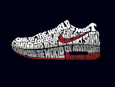
Darks or lights, used for effect, to hold the reader`s attention, like, the word who make a shoe are light colors, and they are on the black color.
Thursday, 10 September 2015
Effective white space
Rythm
The flow or movement of repeating elements that smoothly take advantage of the natural movement of the reader`s eye, like, have flowing rythm on the white effects below the coke words, and have a progressive rythm in the stars and balls who are going out of the coke.
Formal Balance
Informal Balance
Where elements on the page are asymmetrically balanced, like, the page are in total asymmetrically, if you cut in the half, you not will have the same things.
Wednesday, 9 September 2015
Proportion
The element design call proportion is clearly to see in this photo, because the coffee cup is more big than a person.
Line
The design element on this advertisements is illustrate on the title " The Advertisement", is clearly the Line design in this advertisement.
Z-Rule
The Z-Rule in this advertisement start on the text in the up left on the photo, and after go to the up centre, and at least to the brand of the advertisement, you go look for this advertisement like a "Z".
Subscribe to:
Comments (Atom)


